Elanadu Dream Bun Product Packaging Design : A Masterclass in FMCG Snack Packaging Design
The
modern fast-moving consumer goods (FMCG) landscape is a battlefield,
particularly in the sweet snack and bakery aisle. When a brand launches a new
product, the packaging is the primary silent salesperson, tasked with capturing
attention, conveying taste, and triggering an emotional response in a fraction
of a second. Elanadu’s recent launch of their new cream-filled bun roll, aptly
named the "Dream Bun," is a striking example of modern
packaging design done exceptionally well.
Launching
in two classic crowd-pleasing flavours Vanilla and Butterscotch the Dream Bun
packaging utilizes a highly effective visual vocabulary. It blends irresistible
appetite appeal with a joyful, kid-centric brand identity. In this
comprehensive design analysis, we will break down the visual hierarchy, colour
psychology, typography, mascot integration, and the subtle background elements
that make this packaging a textbook example of high-impact retail design.
1. The Strategy Behind the 'Dream Bun' Visual
Identity

Before diving
into the pixel-level details, it is crucial to understand the overarching
strategy of the Dream Bun packaging. The target demographic for a cream-filled
sweet bun is dual-layered: the primary consumers are children, but the primary
purchasers are parents.
The design successfully bridges this gap. For the child, it offers a vibrant, animated, and fun-filled aesthetic that promises a sweet, joyful experience. For the parent, the clean lines, prominent branding, clear product depiction, and highly visible vegetarian marker (the green dot) communicate trust, transparency, and quality. By balancing playful elements with a highly realistic, appetizing product shot, Elanadu ensures the product stands out on a crowded supermarket shelf while instantly communicating exactly what is inside the wrapper
2. Visual Hierarchy: Guiding the Consumer's Eye

A
successful packaging design directs the consumer’s eye in a specific sequence.
The Dream Bun utilizes a masterful vertical visual hierarchy that reads perfectly
from top to bottom.
- The Anchor (Top): The eye is immediately
drawn to the iconic Elanadu logo. Encased in a deep blue pill shape with a
bright yellow sun rising behind it, it establishes brand trust and
recognition right at the crown of the package.
- The Hook (Center-Top): Immediately below the logo,
the product name "DREAM BUN" dominates the upper third of the
canvas. The massive, bubbly lettering acts as a billboard, visible from
several feet away.
- The Proof (Center): The eye then drops to the
high-definition product photograph a diagonally sliced bun revealing a
generous swirl of cream. This is the appetite trigger.
- The Connection (Bottom
Right): The
gaze shifts to the 3D animated boy gazing up at the bun, creating an
emotional anchor.
- The Closer (Bottom Left): Finally, the eye lands on
the flavours tag ("VANILLA" or "BUTTERSCOTCH") encased
in a dynamic speech bubble, confirming the specific product choice before
the item goes into the shopping cart.
This
deliberate sequencing ensures that within three seconds, a shopper knows the
brand, the product, the texture, the feeling, and the flavours.
3. Colour Psychology: Formulating flavours Profiles
Colour is
arguably the most powerful tool in packaging design. It dictates the mood and
helps differentiate variants on the shelf. Elanadu has chosen distinct,
deliberate palettes for its Vanilla and Butterscotch variants, ensuring they
look like part of the same family while remaining easily distinguishable.
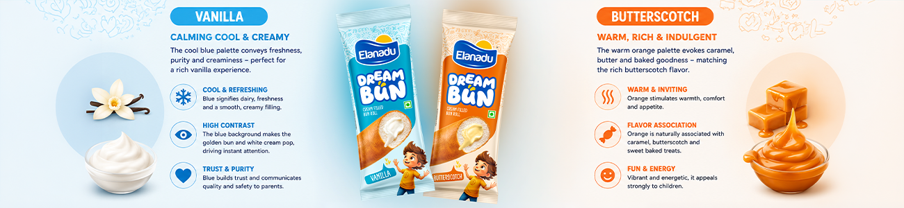
The Calming Cool of Vanilla
For the
Vanilla variant, the dominant background colour is a soft, vibrant sky blue. In
food packaging, blue is often used to denote dairy, creaminess, and coolness,
making it the perfect backdrop for a white, vanilla- flavoured cream filling.
Furthermore, the blue creates a stunning complementary contrast with the
golden-brown crust of the baked bun. This high-contrast approach makes the
product photography pop off the packaging, ensuring the bun looks freshly baked
and the cream looks startlingly pure.
The Warm Energy of Butterscotch
The
Butterscotch variant shifts to a warm, inviting palette of bright orange and
peach. Orange is heavily associated with caramel, butter, and baked goods,
perfectly mirroring the flavours profile of butterscotch. Unlike the
contrasting blue of the vanilla pack, the butterscotch design utilizes an
analogous colour scheme. The warm background harmonizes with the golden-brown
bun and the slightly yellowish-cream filling, creating an overall aesthetic
that feels rich, sweet, and comforting.
Both
colourways utilize a darker shade block behind the "Dream Bun"
typography to ensure the white text remains highly legible, demonstrating
excellent functional design.
4. Typography That Speaks to Fun
Typography
in FMCG design must do more than just relay information; it must convey the
personality of the product. The typography chosen for the "DREAM BUN"
title is incredibly strategic.
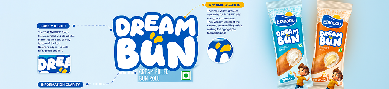
- Bubbly and Soft: The font is heavily
rounded, bubbly, and almost cloud-like. This is a direct visual
translation of the word "Dream" and heavily implies the soft,
pillowy texture of the bun inside. There are no sharp edges or harsh
angles, signalling that this is a safe, gentle, and fun product.
- Dynamic Accents: Above the 'U' in
"BUN," there are three floating yellow droplets or splashes.
This tiny detail adds a tremendous amount of kinetic energy to the design.
It hints at the rich, liquid nature of the cream filling, making the
typography itself feel appetizing.
- Information Clarity: In stark contrast to the
playful title, the descriptor text "CREAM FILLED BUN ROLL" is
rendered in a clean, modern, sans-serif font. This ensures that while the
branding is fun, the actual description of the product remains immediately
legible for parents scanning the shelves.
5. Mascot Magic: Building Brand Connection
One of
the standout features of the Dream Bun packaging is the inclusion of the 3D
animated character at the bottom right. Incorporating a mascot is a proven
strategy in youth-oriented snack marketing, and Elanadu has executed this flawlessly.
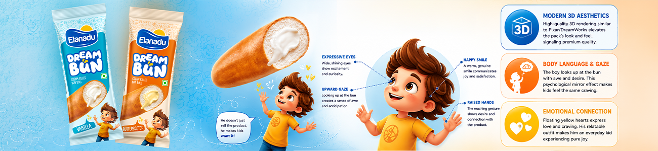
- Modern Aesthetics: Unlike flat, 2D vector
illustrations of the past, this character is rendered in a high-quality 3D
style reminiscent of modern Pixar or DreamWorks animation. This
immediately elevates the perceived quality of the product, aligning it
with the premium entertainment media children consume today.
- Body Language and Gaze: The boy is not looking at
the consumer; he is looking up at the giant bun with an expression of pure
awe and anticipation. His hands are slightly raised in a reaching gesture.
This creates a psychological mirror effect. By showing the character
desiring the product, the packaging subliminally instructs the child
looking at it to feel the same desire.
- Subtle Details: The little yellow hearts
floating near the character’s head reinforce the emotion of love and
craving. His casual clothing (a yellow t-shirt and blue jeans) makes him
relatable, an everyday kid experiencing a moment of pure joy.
6. The Appetite Appeal: Product Photography and
Realism
While
mascots and fun fonts capture the imagination, food packaging must ultimately
sell taste. The central product image is the heart of the Dream Bun design.
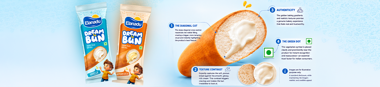
- The Diagonal Cut: Instead of showing the bun
whole or cut straight across, the designer has opted for a steep diagonal
cross-section. This maximizes the surface area of the exposed filling,
allowing for a massive, tantalizing display of the cream.
- Texture Contrast: The photography expertly
captures the porous, spongy texture of the baked bread and contrasts it
against the smooth, glossy, rich swirl of the cream filling. This visual
texture contrast is highly effective in triggering salivary responses.
- Authenticity: The inclusion of the
"Images are for illustration purpose only" disclaimer along the
left edge is a standard legal requirement, but the image itself feels
grounded in reality. The golden baking gradients on the crust of the bun
promise a genuine bakery experience.
- The Green Dot: Positioned clearly near the
product shot is the vegetarian symbol (a green dot inside a green square).
In the Indian market, this is a non-negotiable element. Placing it
prominently ensures immediate reassurance for vegetarian consumers,
removing any friction from the purchasing decision.
7. Background Elements: The Subtle Power of Doodle
Art
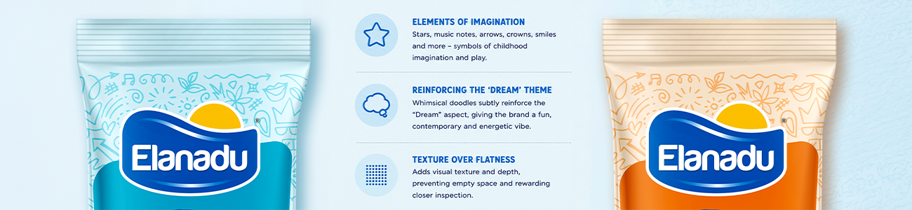
Perhaps
the most understated yet brilliant element of this packaging design lies in the
top background quadrant. Behind the Elanadu logo, the background transitions
into a lighter shade, covered in faint, doodle-style line art.
- Elements of Imagination: The doodles include stars,
musical notes, abstract arrows, geometric shapes, crowns, and smiling
faces. These are the universal symbols of childhood imagination, school
notebooks, and playtime.
- Reinforcing the 'Dream'
Theme: By
placing these whimsical elements in the background, the design reinforces
the "Dream" aspect of the brand name without overwhelming the
primary information. It gives the packaging a slight "pop art"
or "street art" edge that keeps it feeling contemporary and
energetic.
- Texture Over Flatness: From a purely graphic
design standpoint, these faint doodles prevent the top half of the
packaging from feeling empty or flat. They add a layer of visual texture
that rewards closer inspection when the consumer is actually holding the
product in their hands.
8. The Flavours Tags: Anchoring the Design

Finally,
the flavours callouts at the bottom left "VANILLA" and
"BUTTERSCOTCH" are handled with excellent typographic flair. Encased
in an asymmetrical, dynamic speech bubble shape that points toward the mascot,
they tie the whole bottom section together. The slight tilt of the text adds to
the informal, energetic vibe of the overall composition. By using white text
against a darker background (blue or orange), the flavour is unmistakable,
ensuring retail workers can easily stock shelves and consumers can grab their
preferred choice without hesitation.
Conclusion: A Triumph of Snack Packaging
The
Elanadu Dream Bun packaging design is a triumph of modern FMCG visual strategy.
It does not rely on a single gimmick; instead, it orchestrates multiple design
principles in perfect harmony. The colour psychology sets the mood, the typography
establishes the brand voice, the mascot builds an emotional bridge to the
target audience, and the stunning product photography seals the deal with
undeniable appetite appeal.
By
analysing this packaging, it becomes clear that every curve, colour choice, and
character expression was meticulously crafted to maximize shelf impact and
consumer connection. For brands looking to launch a product in the competitive
sweet snack category, the Dream Bun stands as a stellar blueprint on how to
turn packaging into a powerful engine for desire and sales.