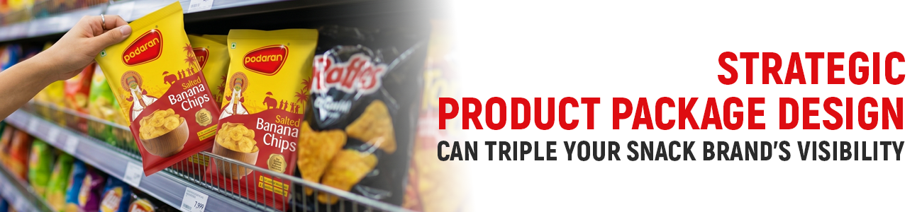
How Strategic Product Package Design Can Triple Your Snack Brand’s Visibility
In the
hyper-competitive snack industry, the battle for consumer attention isn't
fought on the tongue; it is fought on the shelf. With thousands of options
vying for a split-second of eye contact, your brand’s survival hinges on a
single factor: visibility. When we talk about product packaging design, we
aren’t just discussing aesthetics we are discussing a psychological trigger, a
silent salesperson, and a brand’s most potent marketing tool.
At
Rainbowgraph, we view the shelf as a high-stakes gallery where only the most
strategic designs survive. If your snack brand is currently blending into the
background, it’s time to rethink the architecture of your visual identity. This
is why expert snacks package designing is no longer a luxury it is a survival
requirement. Here is how strategic product packaging design can act as a force
multiplier, tripling your visibility and, ultimately, your revenue.
1. The 3-Second Rule: Mastering Shelf Impact
In a typical
retail environment, a consumer spends less than three seconds scanning a
category before making a decision. Professional product packaging design must
capitalize on these three seconds by creating a "stop-and-stare"
effect. When you invest in high-quality snacks product package designing, you
are essentially buying a ticket to the consumer's subconscious mind.
The Contrast Principle
Visibility
is relative. If every competitor is using bright neon colours, a minimalist,
matte-black bag becomes the most visible item on the shelf. Mastering shelf
impact through product packaging design requires a deep competitive analysis.
By identifying the visual "noise" of the category via snacks package
designing research, we can design a package that acts as the
"signal."
Visual Weight and Hierarchy
Where
does the eye land first? A successful product packaging design directs the
viewer’s gaze through a deliberate hierarchy. This is a core pillar of snacks
package designing at Rainbowgraph.
- The Hook: A bold graphic or colour
block that stops the scan.
- The Brand: A clear, legible logo that
establishes trust.
- The USP: A concise benefit (e.g.,
"High Protein," "No Added Sugar").
2. The Psychology of colour: The Rainbowgraph
Spectrum
colour is the first thing the human brain
processes, even before shapes or text. In the world of snacks, colour isn't
just about looking "pretty" it’s about flavour expectation and
emotional resonance. This is a critical element of snacks product package
designing.
Triggering Flavors through Product Packaging Design
- Red: Evokes heat, spice, and
energy. Ideal for chili-flavoured chips or bold snacks.
- Yellow/Orange: Triggers feelings of
happiness and hunger. Often used for cheese-based products or corn snacks in
snacks product package designing.
- Green: Communicates health,
freshness, and organic qualities. Essential for "better-for-you"
product packaging design.
- Blue: Rare in food, blue creates
a sense of "coolness" or "saltiness" (think sea salt
variants) in modern snacks product package designing.
Strategic
product packaging design uses these psychological shortcuts to communicate flavour
and quality instantly, reducing the cognitive load on the consumer. When snacks
package designing is done right, the customer tastes the product with their
eyes before the bag is even opened.
3. Structural Innovation: Breaking the
"Bag" Mold
Most
snack brands default to the standard pillow pouch or stand-up bag. While
functional, these shapes are predictable. To triple your visibility, you must
consider the physical form of your product packaging design. At
Rainbowgraph.in, we believe that snacks package designing should push the
boundaries of traditional geometry.
Tactile Experience in Snacks Product Package
Designing
Visibility
isn't just about sight; it’s about the invitation to touch. Incorporating spot
UV coatings, soft-touch laminations, or embossed textures into your product
packaging design creates a multi-sensory experience. When a consumer picks up a
package to feel its texture, the "dwell time" increases. This is why
detail-oriented snacks package designing is so effective at boosting conversion
rates.
Functional Geometry
Could
your package be a hexagon? A rigid tube? A re-sealable tray? Unique structures
create "visual friction" on the shelf. They break the vertical lines
of standard bags, forcing the consumer to pause. Professional product packaging
design leverages these shapes to claim more "visual real estate." In our
snacks package designing process, we prioritize both form and function.
4. Typography as a Brand Anchor
Typography
is often an afterthought in snack design, yet it carries the brand’s voice. In product
packaging design, the font is the "tone of voice" of your product. If
your snacks package designing lacks typographic character, your brand will feel
generic.
- Hand-drawn scripts: Suggest artisanal,
small-batch, and "homemade" quality.
- Bold Sans-Serifs: Communicate modernity,
transparency, and energy in product packaging design.
- Vintage Serif fonts: Evoke nostalgia and premium
heritage in snacks product package designing.
Visibility
is lost when fonts are too thin to read or too cluttered. Strategic product
packaging design ensures that the product name is the hero. Through expert snacks
product package designing, we ensure high-contrast kerning and placement that
pops.
5. The "Better-for-You" Shift:
Transparency and Trust
The
modern snack consumer is increasingly health-conscious. They aren't just
looking for a snack; they are looking for a label they can trust. Your product
packaging design must reflect this transparency. This trend is currently dominating
snacks package designing across India.
The Power of the Window
Seeing
the actual product, the golden hue of a chip or the texture of a granola
cluster builds immediate trust. Incorporating a transparent window into your product
packaging design removes the "mystery." In snacks product package
designing, allowing the product to sell itself is a masterstroke of visibility.
Clean Labelling in Product Packaging Design
Minimalism
is a visibility strategy. By stripping away unnecessary "clutter,"
the core message becomes louder. A clean, breathable snacks package designing approach
signals a clean, healthy product. At Rainbowgraph, our product packaging design
philosophy is: "Less is often more impactful."
6. Digital Visibility: Design for the Small Screen
In the
age of Instagram and e-commerce, your snack brand must be
"thumb-stopping" before it is "shelf-stopping." Modern product
packaging design must be optimized for the digital shelf. This is a specialized
area of snacks package designing that focuses on clarity at small scales.
The "Thumbnail Test" for Snacks Product
Package Designing
Can your
brand be identified in a tiny thumbnail on a smartphone? If the text is too
small, you are losing sales on Amazon or Blinkit. High-contrast product
packaging design performs better in digital environments. When we handle your snacks
product package designing, we test every asset for mobile responsiveness.
Shareability (The "Unboxing" Factor)
Does your
package look good in a flat-lay photo? Brands that lean into aesthetic
excellence in their product packaging design benefit from free "earned
media." Social media-friendly snacks package designing ensures your
customers become your biggest marketers.
7. Sustainability: The New Visibility Standard
Sustainability
is no longer a niche requirement; it is a primary driver of visibility for Gen
Z and Millennial consumers. A snack brand that utilizes compostable materials
or recyclable pouches stands out. This is why eco-conscious product packaging
design is trending upward.
Integrating
eco-credentials into your snacks product package designing through earthy
textures and "Recyclable" callouts communicates brand values. At
Rainbowgraph.in, we help brands transition into sustainable materials without
sacrificing the vibrant visual impact of their product packaging design. Effective
snacks package designing can be both green and gorgeous.
8. Why Rainbowgraph is the Authority in Design
Creating
a package that triples visibility requires a blend of data-driven strategy and
artistic intuition. Our approach to product packaging design at Rainbowgraph.in
is rooted in three core pillars:
- Market Intelligence: We don't design in a
vacuum. We analyse your competitors’ visual footprints to find the gaps for
snacks product package designing.
- Consumer Psychology: We use colour and shape to
tap into subconscious desires via product packaging design.
- Technical Excellence: From prepress to final
production, we ensure your snacks package designing translates perfectly
to the physical shelf.
Whether
you are launching a new protein puff or rebranding a classic potato chip, the
right product packaging design is the bridge to success. Our snacks package
designing team ensures that your brand isn't just another face in the crowd.
9. Case Study: From Invisible to Irresistible
Imagine a
local snack brand struggling with low turnover. Their original product
packaging design was a generic clear bag. By implementing a strategic snacks
package designing overhaul introducing a custom matte-finish pouch and a bold colour
palette the brand saw a 280% increase in shelf velocity.
This
wasn't magic; it was the result of intentional product packaging design
choices. By focusing on the nuances of snacks product package designing, the
brand transformed from a commodity into a premium experience.
10. The Narrative Power of Packaging
Every
snack has a story. Is it a story of ancient grains? Is it a story of explosive
heat? Your product packaging design is the storyteller. Through strategic snacks
product package designing, we translate your brand's "why" into a
visual language that resonates with the soul of the consumer.
When
people buy snacks, they are often buying a mood or a moment. Great product
packaging design captures that moment. Whether it's the joy of a movie night or
the fuel for a workout, your snacks package designing should reflect that
emotional connection.
11. Adapting to Indian Retail Realities
Designing
for the Indian market requires a unique understanding of the local retail
landscape. From the "Kirana" store to the "Modern Trade"
supermarket, your product packaging design must be versatile. High-durability snacks
package designing ensures the product remains pristine even in challenging
logistics environments.
At
Rainbowgraph, we specialize in product packaging design that withstands the
heat and humidity of India while maintaining its visual pop. Our snacks package
designing takes into account everything from local language preferences to cultural
colour associations.
12. Strategic Material Selection
The
choice of substrate is just as important as the graphics in product packaging
design. Should you use a metallic foil, a transparent film, or a kraft paper
finish? The material defines the "premiumness" of your snack’s
product package designing.
- Metallic Finishes: Great for chips and premium
nuts in product packaging design.
- Matte Finishes: Suggests a more organic,
artisanal feel for snacks product package designing.
- Glossy Finishes: Perfect for traditional
candies and high-energy snacks.
The right
material enhances the product packaging design and ensures the product stays
fresh. Freshness is the ultimate driver of repeat purchases, which is why
technical precision in snacks package designing is non-negotiable.
13. The Evolution of Snack Branding
The snack
industry is moving away from "cartoonish" mascots toward
sophisticated, lifestyle-oriented product packaging design. Modern snacks
package designing focuses on clean lines and bold photography. If your brand
looks like it’s stuck in the 90s, you are losing out on the modern consumer.
Updating
your product packaging design is the fastest way to signal that your brand is
evolving. Through a fresh snacks package designing perspective, we can
revitalize even the most legacy brands for today's market.
14. Cost-Effective Scaling Through Design
Good
design doesn't have to be expensive to produce. Strategic product packaging
design often involves optimizing the number of colours used to reduce printing
costs. In our snacks package designing process, we balance aesthetic brilliance
with production efficiency.
We help
you achieve a high-end look in your product packaging design without breaking
the bank. By choosing the right printing methods during the snacks package
designing phase, we ensure your margins remain healthy while your visibility
soars.
15. Conclusion: Your Brand Deserves to Be Seen
Visibility
is the oxygen of your brand. Without it, even the most delicious snack will
wither on the shelf. By investing in professional product packaging design, you
are not just buying a "box" you are buying a competitive advantage.
Is your
snack brand ready to triple its visibility? The journey starts with a design
that refuses to be ignored. Visit Rainbowgraph.in to explore how we can
transform your product packaging design into your most powerful asset.
Let us take your snacks package designing to the next level.
Why Choose Rainbowgraph.in?
- Expertise in Product
Packaging Design: Over a decade of experience in visual
storytelling.
- Specialized Snacks Product
Package Designing: We understand the nuances of the food and
beverage industry.
- Holistic Product Packaging
Design: From
concept to the retail shelf.
- Innovative Snacks Product
Package Designing: Staying ahead of global trends.
- Focus on Product Packaging
Design SEO:
Helping your brand get discovered online and offline.
- Customized Snacks Product
Package Designing: Tailored solutions for every budget.
- Result-Oriented Product
Packaging Design: Our designs are built to sell.
- Premium Snacks Product
Package Designing: Elevating local brands to global standards.
By
focusing on these strategic elements, your snack brand won't just occupy space it
will own it. Product packaging design is the ultimate investment in your
brand’s future. Make it count with elite snacks package designing from the
masters of the craft.