The Evolution of the Dairy Aisle: A Comprehensive Analysis of Elanadu Zero Percent Milk Powder Dairy Packaging Design

The Indian dairy market is undergoing a seismic shift. No longer is milk
just a commodity; it is a lifestyle choice. Central to this transformation is
the art of dairy products branding, which has evolved from simple functional
containers to sophisticated tools of consumer engagement. Today, we are
deep-diving into a masterclass of modern aesthetics: the Elanadu Zero Percent
Milk Powder Milk and Skimmed Curd range.
In this exhaustive 3,000-word analysis, we will explore how Milk packaging
serves as the primary bridge between a brand’s promise and the consumer’s
kitchen. By examining the intricacies of Dairy packet designing, we can
understand how Elanadu is positioning itself as a leader in the
health-conscious segment through innovative Milk Pouch packaging.
The
Historical Context of Dairy Products Branding in India
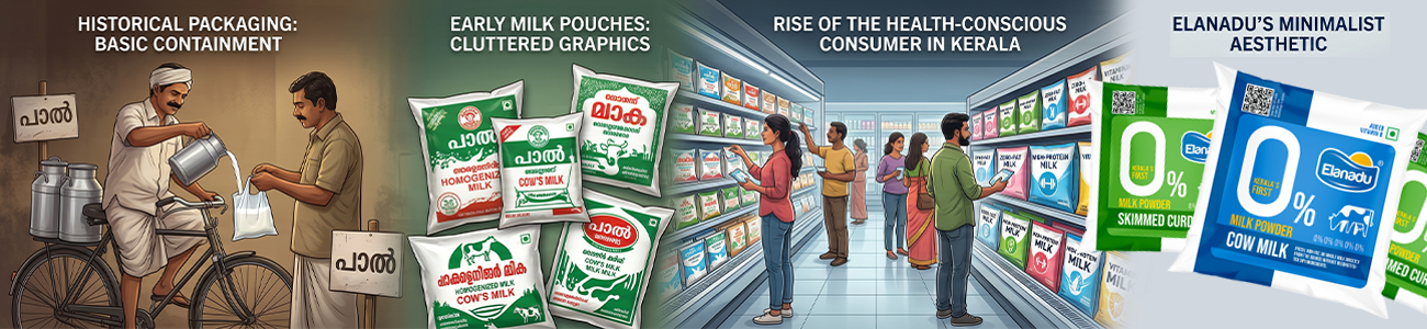
To understand where Elanadu is going, we must look at where dairy products
branding started. Historically, milk in India was either delivered loose or in
very basic, translucent Milk packaging. The primary goal was containment, not
communication. However, as the market matured, the need for Dairy packet
designing that communicated hygiene and shelf-life became paramount.
The rise of the "Health-Conscious Consumer" in Kerala has forced a
revolution in Milk Pouch packaging. People are no longer satisfied with
"just milk"; they want specialized solutions like zero-fat,
high-protein, and vitamin-fortified options. This shift has turned dairy
products branding into a competitive battlefield where design is the ultimate
weapon. Elanadu’s approach to Milk packaging reflects this maturity, moving
away from cluttered, old-school graphics toward a minimalist,
"pharma-clean" aesthetic.
The Power
of the "Zero": Visual Hierarchy as a Sales Tool
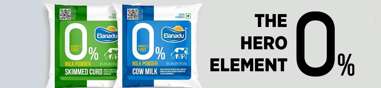
The most defining feature of Elanadu’s Dairy packet designing is the massive
"0%". In the world of Milk Pouch packaging, this is known as the
"Hero Element." When a brand invests in dairy products branding, they
must decide what their "Single Minded Proposition" (SMP) is. For
Elanadu, it is the absence of fat.
By making the "0" the focal point of the Milk packaging, the
designers have ensured that the product’s USP is visible from ten feet away.
This is a crucial aspect of Dairy packet designing solving the "shelf-search"
problem. In a sea of blue and white bags, this bold, oversized numeral acts as
a beacon. Furthermore, the way the Milk Pouch packaging integrates the text
"Kerala’s First" inside the zero reinforces a sense of pioneering
spirit, a key pillar in their dairy products branding strategy.
Colour
Psychology: Navigating the Blue and the Green
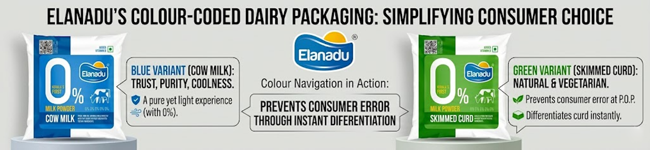
Effective Milk packaging relies heavily on Colour to navigate the consumer
through different SKUs. In Elanadu’s Dairy packet designing, they have utilized
a high-contrast palette that aligns with global dairy standards while
maintaining local relevance.
·
The Blue Variant (Cow Milk): This is the
cornerstone of dairy products branding. Blue represents trust, purity, and the
coolness of fresh milk. In Milk Pouch packaging, blue is often used to denote
"Standard" or "Whole" milk, but here, paired with the
"0%", it signifies a "pure yet light" experience.
·
The Green Variant (Skimmed Curd): Green
is the universal signifier for "Natural" and "Vegetarian."
For the curd variant, this choice in Dairy packet designing helps differentiate
the product from liquid milk immediately. It’s an essential part of Milk Pouch
packaging strategy to prevent consumer error at the point of purchase.
This Colour-coded approach to dairy products branding ensures that as
Elanadu expands its product line, the Milk packaging remains cohesive yet
distinct.
Technical
Specifications: Dairy Packet Designing for Freshness
When we discuss Milk Pouch packaging, we aren't just talking about the
graphics; we are talking about the science of preservation. Milk powder is
highly hygroscopic, meaning it absorbs moisture from the air. Therefore, the
Dairy packet designing must incorporate high-barrier laminates.
Elanadu’s Milk packaging appears to use a multi-layer structure, likely
involving PET, Met-PET, and PE. This technical side of dairy products branding
is invisible to the consumer but vital for brand loyalty. If the Milk Pouch
packaging fails and the powder clumps, the brand’s reputation is ruined. Thus,
good Dairy packet designing is a marriage of form and function.
The gloss finish on the Milk packaging isn't just for looks it provides a
tactile sensation of cleanliness, which is a subtle but powerful part of dairy
products branding. A matte finish might feel "organic," but in the
dairy world, gloss often equals "hygienic," a key factor in
successful Milk Pouch packaging.
Iconography
and Localized Trust in Dairy Products Branding
A major challenge in Milk packaging is building trust without
over-explaining. Elanadu uses iconography within their Dairy packet designing
to bypass language barriers.
·
The Cow Silhouette: By including a clean,
stylized cow icon, the Milk Pouch packaging grounds the high-tech
"0%" claim in traditional farming. This balance is vital for dairy
products branding in a state like Kerala, where consumers value both
modernization and tradition.
·
The QR Code: This is the pinnacle of
modern Milk packaging. By placing a QR code prominently in the Dairy packet
designing, Elanadu invites the consumer into their factory. This transparency
is a "trust-accelerator" in dairy products branding, moving the Milk
Pouch packaging from a static object to an interactive portal.
The
"Kerala’s First" Narrative in Milk Pouch Packaging
Regional pride is a massive factor in dairy products branding. By claiming
the title of "Kerala's First," Elanadu’s Milk packaging taps into the
"Vocal for Local" sentiment. This specific bit of Dairy packet
designing positions the brand as an innovator that understands the local palate
better than national giants.
In the competitive world of Milk Pouch packaging, being "first" is
a powerful psychological trigger. It suggests that the brand has invested in
specific technology for the region, making their dairy products branding feel
personalized. This level of detail in Milk packaging is what separates a market
leader from a follower.
Copywriting
and Information Architecture in Dairy Packet Designing
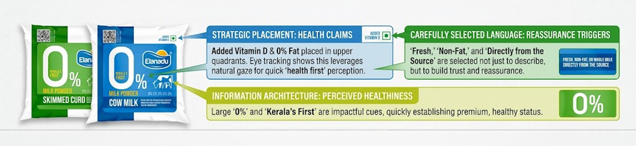
Let’s look at the "fine print" on the Milk Pouch packaging. The
choice of words like "Fresh," "Non-Fat," and "Directly
from the Source" are carefully selected for dairy products branding. These
aren't just descriptions; they are "reassurance triggers."
In Milk packaging, the information architecture (where the text goes) is as
important as the text itself. Elanadu’s Dairy packet designing places the most
important health claims (Added Vitamin D, 0% Fat) in the upper quadrants, which
is where the eye naturally lands first. This is a textbook example of how Milk
Pouch packaging can influence the "perceived healthiness" of a
product through dairy products branding.
Comparing
Elanadu to Traditional Milk Packaging
If you look at traditional Dairy packet designing in India, you often see
realistic photos of milk splashing into a glass. While this is appetizing, it
has become a "visual cliché." Elanadu’s dairy products branding
breaks this mould by using vector illustrations.
This shift in Milk packaging style makes the product look more
"premium" and "technological." It moves the Milk Pouch
packaging away from the commodity shelf and toward the "functional
food" shelf. For dairy products branding, this is a strategic move to
justify a higher price point or to target a more affluent, urban demographic.
The minimalism in their Dairy packet designing speaks to a consumer who is
tired of "loud" marketing.
Conclusion:
The Verdict on Elanadu's Design Strategy
In summary, the Milk packaging for Elanadu Zero Percent Milk Powder Milk is
a masterclass in clarity. Through strategic Dairy packet designing, the brand
has managed to communicate complex health benefits instantly. Their Milk Pouch
packaging is not just a container; it is a declaration of quality.
The success of their dairy products branding lies in its simplicity. By
focusing on the "0%," using smart Colour coding, and leveraging
regional pride, they have created Milk packaging that stands out. As we look at
the future of Dairy packet designing, Elanadu serves as a blueprint for how to
balance modern aesthetics with traditional values in Milk Pouch packaging.
Successful dairy products branding is an ongoing journey. With this launch,
Elanadu has set a high bar for Milk packaging in the Indian dairy sector. Their
commitment to excellence in Dairy packet designing ensures that their Milk
Pouch packaging will remain iconic for years to come.