The Passport of a Spice Jar: How Design Transports the Indian Soul to the Global Market
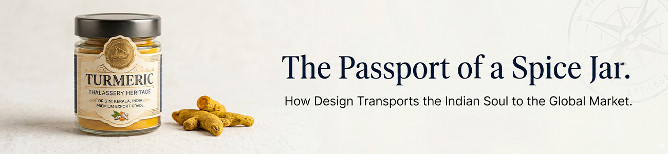
For sixteen years, within the creative walls of our
Thalassery studio, we have acted as more than just graphic designers. We have
been cartographers and cultural translators. With a legacy spanning over 6,000
brand designs, particularly within the premium FMCG sectors of dairy, snacks,
and spices, Rainbowgraph has pioneered a specific aesthetic movement in the
Indian market: the marriage of deep-rooted heritage with "Eurostyled"
sophistication.
This analysis explores the metabolic transformation
of a single protagonist an Indian spice jar as it sheds the "graphic
noise" of its local upbringing to claim its rightful place in the luxury
boutiques of London, Paris, and New York.
The Departure: The
Weight of Unfiltered Tradition
In the spice markets of Kerala, a jar of Alleppey
Turmeric or Malabar Cardamom is born with an ancient soul. It carries the
humidity of the monsoon and the ancestral wisdom of the soil. However, when we
first encounter these "local heroes" at Rainbowgraph, they are often
trapped in an architectural prison of "noise."
Traditional packaging often suffers from a
perceived need to scream. Every square millimetres of the substrate are
occupied by competing elements: fluorescent starbursts claiming "extra
quality," cluttered imagery of sprawling plantations, and a cacophony of
multiple typefaces that lack hierarchy. This is the "cluttered
departure." To a local consumer, this noise signifies familiarity; to a
global consumer in a premium environment, it signifies a lack of integrity.
The product, though possessing an exemplary soul,
lacks a "passport." It is confined by its visual dialect, unable to
communicate its value to a connoisseur in a high-end Parisian arrondissement
who equates silence with prestige. Our task is not to erase the Indian soul,
but to give it the "Visual Hygiene" necessary to navigate
international borders.
The Geometry of
Purity: The Rainbowgraph Process
At Rainbowgraph, the transformation begins with a
rigorous application of European Minimalism. We treat the packaging as a piece
of architecture.
Visual Hygiene and
the Removal of Noise
Visual Hygiene is the cornerstone of our
philosophy. It is the process of clinical subtraction. We identify every
"non-essential" element on the package the shadows, the gradients,
the redundant claims and we remove them. By purifying the canvas, we allow the
product to breathe.
In "Eurostyling," the "less is
more" mantra is not a stylistic choice but a functional one. A
"pharma-clean" aesthetic creates an immediate psychological
association with purity and safety. In the FMCG world, especially with spices
that are ingested, trust is the primary currency. A clean,
white-space-dominated design communicates that the brand has nothing to hide.
It suggests that the product inside is so superior that it does not need to
hide behind graphic clutter.
The Technicality of
White Space
White space is not "empty" space; it is a
structural element. In the architecture of a spice jar, white space serves as
the "gallery wall" upon which the product’s name is hung. It directs
the eye, provides cognitive rest, and elevates the perceived price point. When
a consumer sees a jar that isn't shouting, they instinctively understand it is
worth more.
The 85mm Lens:
Capturing the Hero
If the packaging is the architecture, the
photography is the soul's portrait. At Rainbowgraph, we move away from the
flat, clinical "catalogue" shots of the past. We view our products
through the lens of a Sony A1, paired with an 85mm f1.4 lens.
The Anatomy of
Detail
The 85mm perspective is essential for creating
"Anthropomorphic Storytelling." This lens, traditionally used for
high-fashion portraiture, treats the spice jar like a person. By shooting at a
shallow depth of field (f1.4), we achieve a soft, creamy bokeh that isolates
the product from its environment.
The Sony A1’s hyper-realistic sensor allows us to
capture the "integrity" of the texture. We see the microscopic
crystalline structure of sea salt; we feel the fibrous skin of a cardamom pod.
This level of detail builds an intimacy between the consumer and the product.
It isn't just "turmeric powder"; it is an amber landscape of spice.
This visual language speaks to the global consumer's desire for "authentic
luxury" a product that is raw yet refined.
The Typography of
Trust: From Decorative to Structural
Typography is the "voice" of the brand.
Most traditional spice packaging utilizes decorative, serif, or
"ethnic" fonts that inadvertently "other" the product,
pigeonholing it into the "international aisle" rather than the
"premium spice" section.
Our transition involves a move toward premium
sans-serifs typefaces that are geometric, balanced, and timeless.
- The Sans-Serif Mandate: We look for fonts with open apertures and generous kerning. This
ensures readability at a distance and communicates a modern, global
outlook.
- Hierarchical Integrity: By utilizing different weights of a single typeface rather than
multiple different fonts, we create a sense of order. The product name
remains the hero, supported by technical details (origin, weight, notes)
in a disciplined, grid-based layout.
The Colour
Psychology of Sophistication
While traditional Indian design often leans on
vibrant, saturated primary colours, Eurostyling demands a more nuanced palette.
We utilize "tonal sophistication."
Instead of a generic red for chili, we might use a
deep, matte "Pimentón Crimson." Instead of a bright green for
cardamom, we opt for a muted "Sage Mist." We often utilize metallic
foils or spot UV finishes not for "flash," but to highlight the
"architecture" of the brand mark.
The use of neutral tones charcoals, off-whites, and
warm greys allows the natural colour of the spice to provide the primary visual
interest. The packaging becomes a frame for the product's natural vibrancy.
The Arrival: The
Silent Salesman in the Global Market
When our spice jar finally arrives in a high-end
London boutique, it no longer looks like a "foreign" product; it
looks like an international standard. It has its "passport."
The 3-Second Rule
In the retail environment, a package has
approximately three seconds to capture a consumer's attention. A
"noisy" package requires the brain to work too hard to decode
information. A Eurostyled package, however, acts as a "Silent Salesman."
It communicates its value through its posture, its cleanliness, and its
restraint. It doesn't scream "buy me"; it whispers "possess
me."
Breaking the
Cultural Barrier
Clean design acts as a universal language. It
bypasses cultural biases and speaks directly to the consumer's desire for
quality and sophistication. By stripping away the "cluttered
heritage" and replacing it with "visual hygiene," we ensure that
the Indian soul of the product is presented in a way that the global elite can
recognize and respect.
Conclusion:
Creating International Legacies
At Rainbowgraph, we do not simply "design
boxes." We are the architects of global journeys. Our sixteen-year legacy
in Thalassery has taught us that the world is hungry for the authenticity of
the Indian spice trade, but that authenticity must be presented with the
precision of European aesthetic standards.
By applying Eurostyling, rigorous Visual Hygiene,
and the hyper-realistic detail of 85mm portraiture, we transform local FMCG
products into international icons. We don't just help products move across
borders; we help them build legacies. The "Passport of a Spice Jar"
is a testament to the power of design to elevate a humble ingredient into a
global symbol of prestige.
As we look toward the next sixteen years and our upcoming
brands, our mission remains unchanged: to prove that when you remove the noise,
the soul finally becomes audible to the world.